
- About Us
- Services
- Blog
- Tools
- Careers
- Contact Us

WEBINNOVATORS TOOLS
Free Responsive Design Tester
Preview your website on mobile, tablet, and desktop.
Enter a URL to compare layouts and spot responsive design issues.
Example layout shown. Enter your website URL to start testing.
Mobile · 320px
Tablet · 768px
Desktop · 1024px
Select at least one device to display a preview.
Some websites block embedded previews. Open the page directly ↗Open the page directly if a preview does not load.
Viewport previews are a starting point; check important journeys on real devices too.
How to test your website’s responsiveness
01
Enter your URL
Paste the complete page address.
02
Compare screen sizes
Review mobile, tablet, and desktop layouts.
03
Check the details
Look for clipped text, overflow, and awkward spacing.
What should you check in a responsive website?
Responsive design adapts a page’s layout to different screen sizes. Use these previews as a starting point, then check the page on real devices.
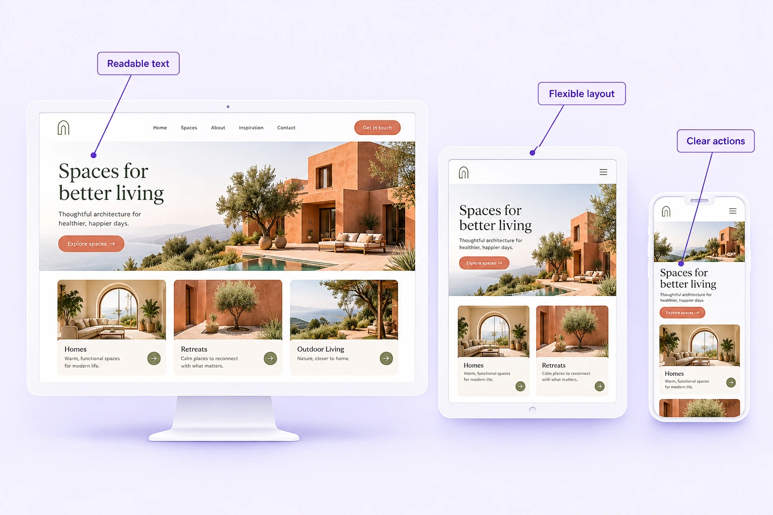
Readable text
Comfortable type sizes without zooming.
Flexible layouts
Content fits without horizontal scrolling.
Usable navigation
Menus and links stay easy to access.
Clear buttons & forms
Actions remain visible and easy to use.
Responsive Design Tester FAQs
What is a responsive design tester?
A responsive design tester previews a webpage at different viewport widths so you can compare how its layout adapts. This tool shows mobile, tablet, and desktop views; it does not produce an automated accessibility, performance, or SEO score.
How do I check if my website is responsive?
Enter the complete page URL, select Test website, and compare the three previews. Look for clipped text, horizontal overflow, overlapping content, and buttons or menus that become difficult to use. Repeat the check on important pages and real devices.
Why is my website preview blank?
Some websites prevent embedding through Content-Security-Policy or X-Frame-Options headers. Login requirements, browser privacy controls, or a non-HTTPS URL can also affect previews. Use Open the page directly and test with your browser’s responsive tools if a frame does not load.
Does this replace testing on real devices?
No. These are browser viewport previews, not emulated mobile operating systems or a complete cross-browser test. Check touch interactions, menus, forms, checkout, and other important journeys on real phones and tablets.
Which screen sizes should I test?
This tester provides 320px, 768px, and 1024px viewport widths as useful starting points. Also test widths between your design’s breakpoints, wider desktop screens, and the devices your visitors actually use.
Is responsive design important for SEO?
Responsive design helps make the same content usable across screen sizes. Google recommends responsive web design, but a responsive layout alone does not guarantee rankings. Useful content, crawlability, mobile content parity, and the overall page experience still matter.
Found a layout issue? Let’s fix it.
Get help creating a clearer, more usable experience across devices.

DISCUSS NEW PROJECT OR JUST TO SAY HELLO GET IN TOUCH WITH US
hello@webinnoovators.com
6th Floor, Ecospace Business Park, 2A, AA II, Premises, Newtown, Rajarhat, Kolkata, West Bengal 700156
© Webinnovators 2025 . All rights reserved.Webinnovators